

Product Design
Branding
Packaging
UX
Timeline
6 weeks
Tools
Figma
Adobe Illustrator
Adobe Photoshop
Skills
Illustration
Collaborators
Sara Bathan
Joe Loughlen
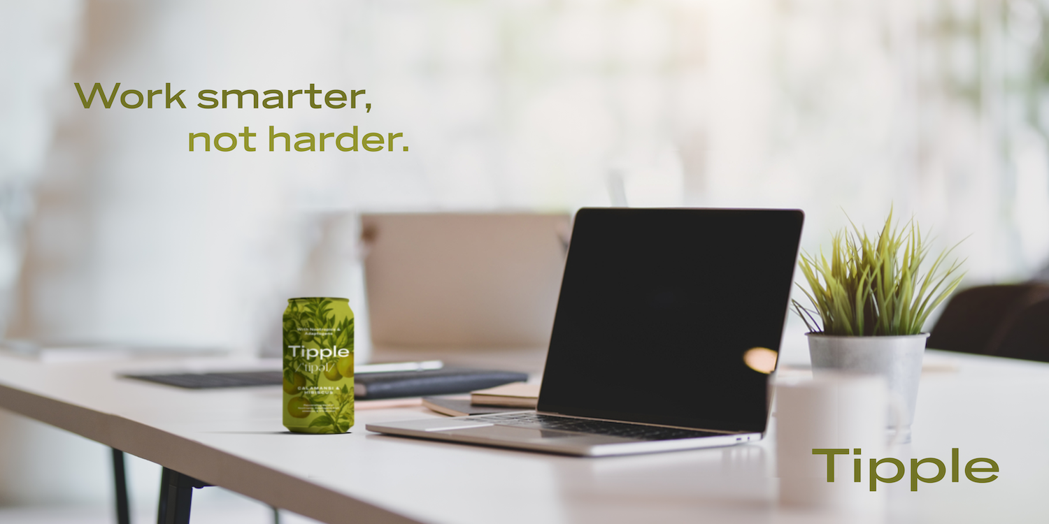
Move over, White Claw. Tipple allows you to indulge and relax, while providing the rejuvenation needed to perform your best.
Challenge
Everyone needs a break. But like it or not, life keeps moving. We know that people want to kick their feet up at the end of the day, maybe crack open a cold one. However, work and responsibilities prevent us from getting the chance to do so. This became the problem we wanted to solve for our users.
What if we could create an alcoholic beverage that provides that feeling of escapism, so resonant with devotees of White Claw, that doesn’t completely derail their evening? What if it could give them the experience of taking a break, while simultaneously refreshing them and ultimately boosting productivity?
Background
2019 was the Year of White Claw. The flavored hard seltzer beverage was everywhere you looked. Low calorie, refreshing, and tropical, White Claw appealed to the masses by bringing a sense of escapism no matter where you drank it.
By capitalizing on the public’s adoration with La Croix, and adding a splash of alcohol, it became an instant hit. Plus, its surrounding narrative of carefree summer fun was impossible to resist. It made us wonder: What else are people craving? What other need is going unfulfilled, and would truly resonate with young people who responded to White Claw in this way?
Solution
The demographic we wanted to reach was young professionals—individuals in their 20s and 30s who are trying to navigate a highly competitive job market and stressful working environments as they get started in their professional careers. Through user research, we discovered the insight that our demographic is overworked, and desperate for a chance to “loosen their tie”—but is, however, prevented from doing so by the unending societal pressure to push ahead.
We wanted to create an alcoholic beverage that concurrently allows the consumer to relax while never disrupting their productivity. We decided that the solution was an innovative blend of nootropics, adaptogens, and alcohol.
Nootropics are supplements or substances which improve cognitive functions, and have also been shown to increase creativity and motivation. Adaptogens, meanwhile, are natural substances which help the body adapt to stress. Not only have nootropics and adaptogens been proven to work well together, but we wanted to make sure they could interact safely with alcohol. Our research showed that alcohol paired with certain types of nootropics (such as L-theanine) can increase their efficacy and boost the positive effects.
Concept board
Our goal was to disrupt the alcoholic beverage industry the way White Claw did by creating an innovative new product whose myth speaks to and resonates with young people.
Process
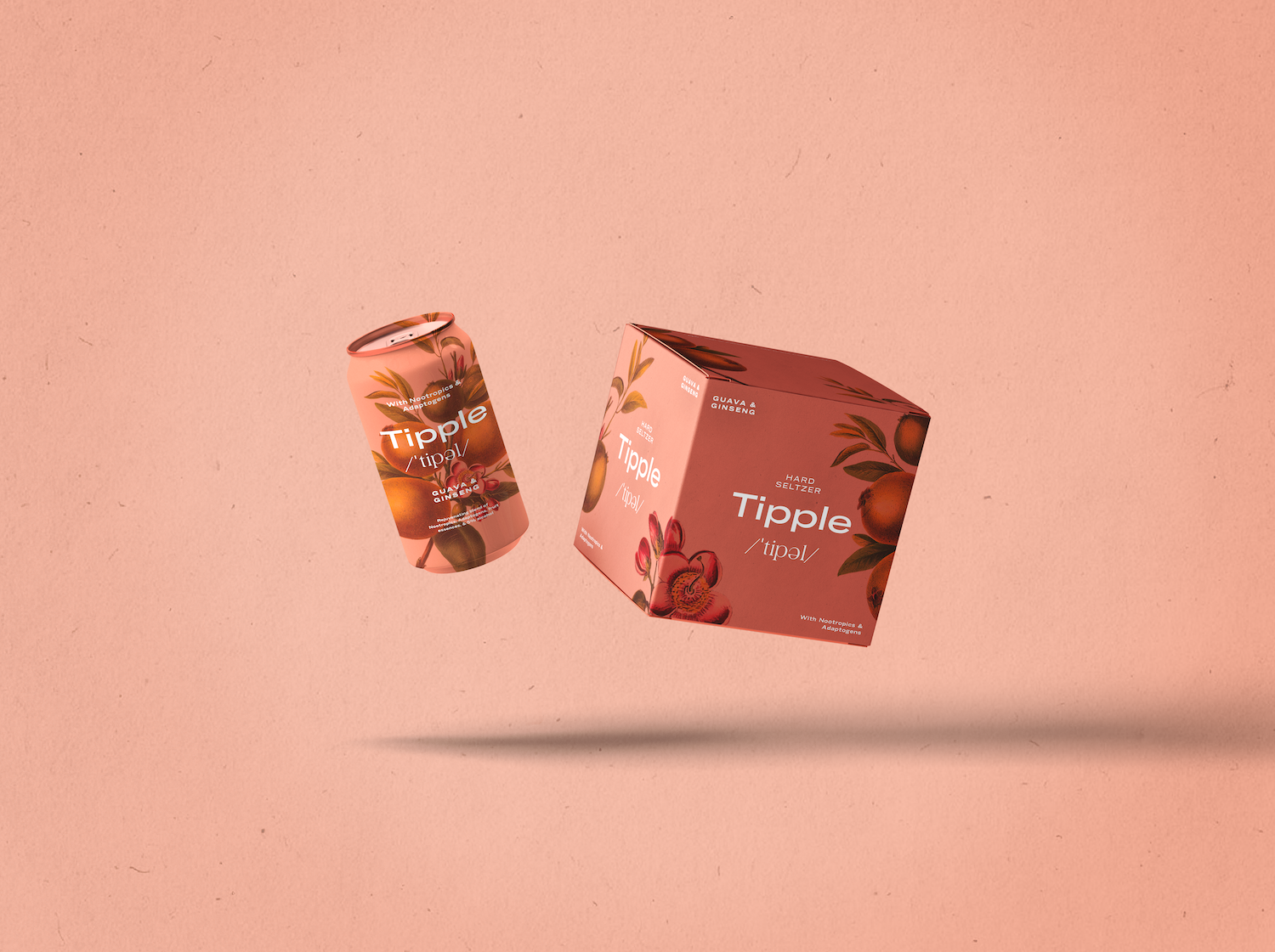
There was a lot of research that was done to make sure our solution was achievable. We investigated multiple varietals of nootropics to find which could be paired safely with alcohol, and selected our flavors based on the positive reaction to more niche fruit and flower essences, such as calamansi and hibiscus.
Since our brand positioned itself as the intellectual beverage choice, we drew our imagery from botany illustrations out of scientific journals. We liked the slight nod here to a vintage aesthetic but wanted to ultimately keep our designs bold and modern, which is reflected in the color and typography.
We used the Benton Sans family extensively—especially Benton Sans Wide, an extended modern sans serif typeface which helped to update the aesthetic of the vintage artwork. Each of the three flavors has a monochromatic palette, which helped to unify and quiet any possible busyness of the can design.
Original iterations of this design involved a black box overlaid with illustrations—which, though eye-catching, created too much of a visual break with the rest of the brand. I changed the boxes to have the same monochrome color scheme as each of their corresponding cans. Ultimately, the change helped to better unify the brand and pack more of a visual punch.


Summary
Tipple hits on a very relatable conundrum commonly faced by young professionals. We created something that would satisfy both the desire to relax without having to deal with the consequence of slacking off. By positioning itself as elevated, and not to be consumed in excess, our product serves to reinvigorate and propel so that people can stay on track and on schedule. Tipple is a win-win on all sides.


Next steps
Moving forward, I would like to broaden the scope of the brand, while further developing its identity. This could be easily done by adding new flavors to the current selection and expanding the color palette.
It would also be an interesting challenge to develop a sister line of non-alcoholic beverages with the same brain-boosting properties (though perhaps a different moniker). It would require diving even deeper into the brand’s identity to create a new product with different attributes, while still possessing a similar aesthetic to tie it back to the original and “keep it in the family”.