


Learn more ↓

The Gig Poster
Timeline
2 weeks
For the final project in poster class, we were assigned artists for whom we’d design a gig poster. I was assigned STRFKR, a band I’d never heard of before. As a starting point, we were required to listen to the artist’s albums, create moodboards about how the music made us feel, read over lyrics, and visualize metaphors. STRFKR would be considered indie rock, with elements of psychedelic pop and electronica.
Besides the band name’s celestial reference, there were plenty of nods to outer space in the lyrics.
I decided to zero in on the surreal, trippy nature of their songs. I wanted to create something that warranted a double take, which appeared as one thing at first, but turned out to be something completely different. After sketching, I settled on the image of celestial-looking beings licking an ice cream cone, in which the ice cream doubled as a brain. Through iterating, I decided to incorporate the text into the folds of the brain itself, so as not to take away from the impact of the imagery.

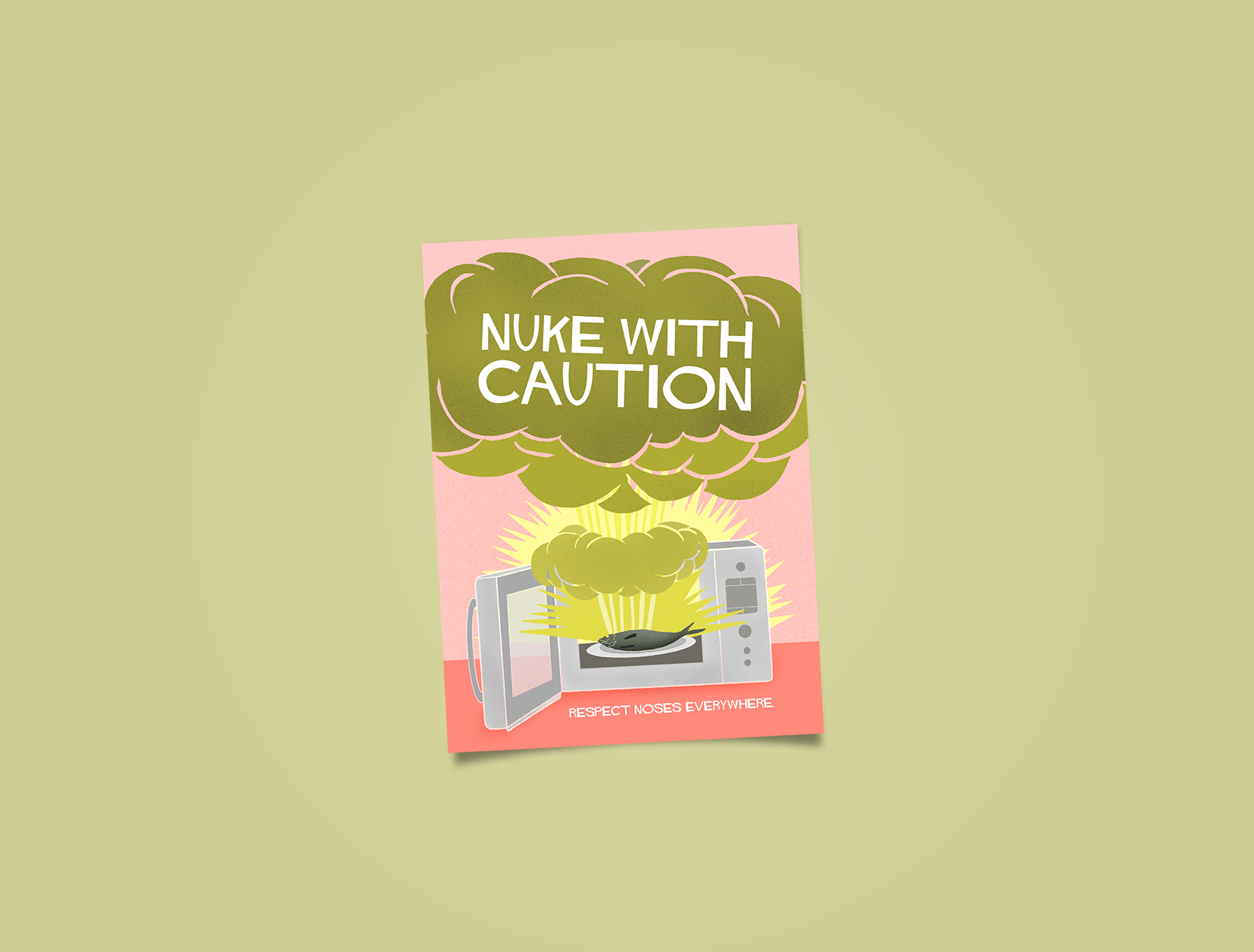
The Propaganda Poster
Timeline
1 week
Our task here was to create a propaganda-themed poster inspired by our most irritating pet peeves. In past experiences, I’ve been annoyed by the use of communal microwaves to revive particularly pungent lunches.
In my research of old propaganda graphics, I came across many WW2-era posters touting the power of the atom bomb. I thought the visuals of a mushroom cloud drew an apt comparison to the stench created by microwaves zapping a hot meal. I chose the most symbolic of all stinky foods—fish—to underline my theme. I wanted to emphasize the message as much as possible through the use of color—sickly greens are highlighted by the opposing coral pink background. The faint grain texture added on the odor cloud gives it depth and makes it leap out at the viewer.
My visual metaphor of an atom bomb continued to see me through, and the double meaning of the term “nuke” led me to “nuke with caution”. The use of color, visuals, and bold typography help to clearly send the message to respect noses everywhere.

The Redesign
Timeline
1 week
This assignment was to make over a preexisting and lackluster poster found “in the wild”. I was designated a poster advertising “Croatiafest”, a yearly event celebrating Croatian culture. The original poster was plain, featuring just the basic information. There was barely any color and no decoration. The overall impression was extremely forgettable.
When I researched Croatian traditions, food, music, dress—I found that it was extremely vibrant culture, which was not at all communicated in the original poster.
I chose to convey this through color, opting for a bright red and orange, two hues commonly found in traditional Croatian dress and textiles. The image of dancers in action added a much-needed sense of movement to the composition. I added lively circles as a backdrop behind the dancers, which are shapes commonly found in historic Croatian patterns.
These changes provided a necessary upgrade that is visually dynamic, as well as a better representation of Croatia’s energetic culture.

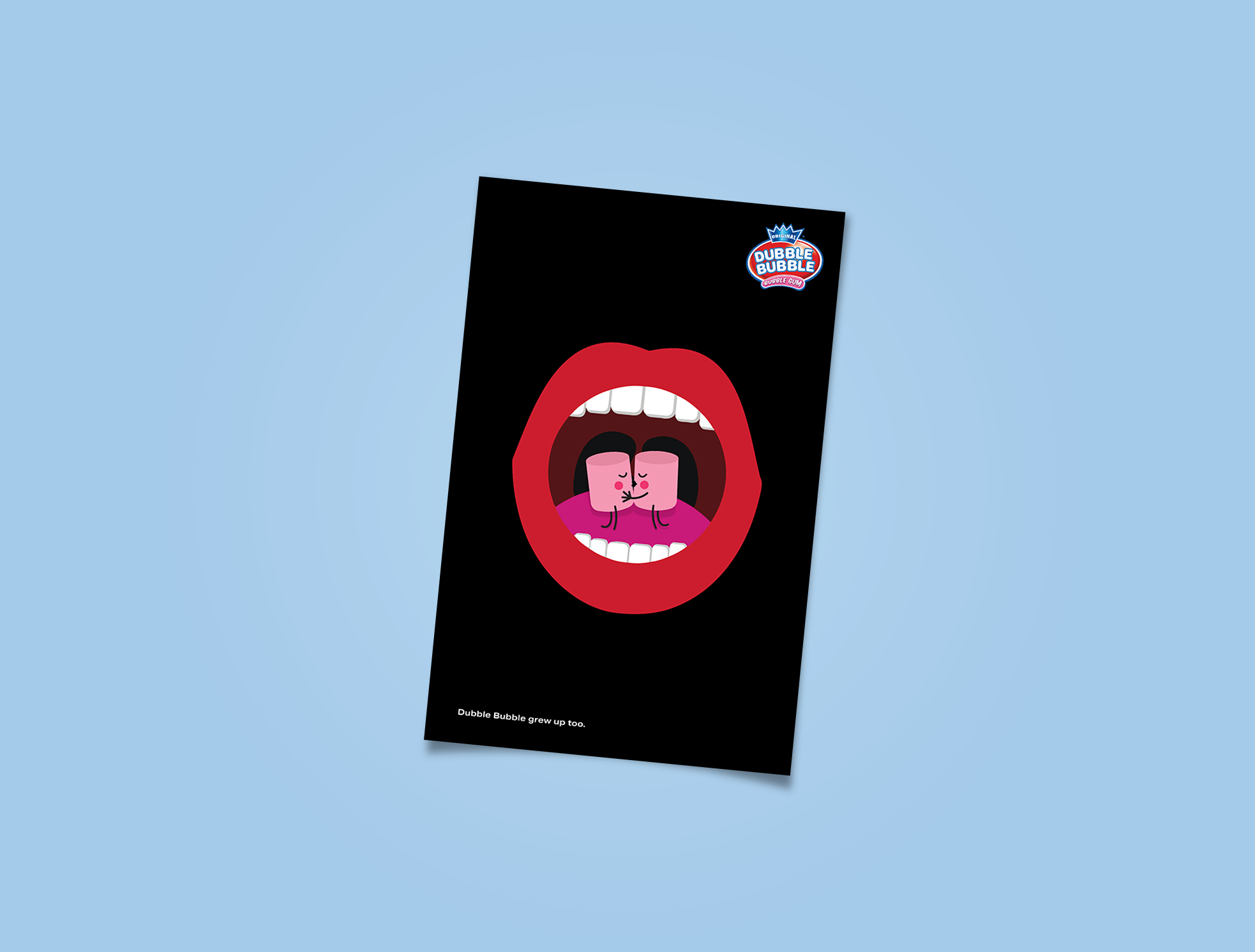
The Ad Campagin
Timeline
1 week
In our advertising class, we were tasked with creating a campaign for Dubble Bubble, with the aim of updating the brand and making it appeal to millennials. The whole concept of bubblegum is usually geared toward children, so Dubble Bubble is missing out on the vast adult demographic group.
While brainstorming, I kept revisiting the insight that chewing bubblegum can transport you back to your younger years and memories that are refreshingly simple and innocent.
I chose to integrate a visual aesthetic geared towards kids with humor that is more grown up. I anthropomorphized the bubblegum so they became characters, and drew the parallel that “Dubble Bubble grew up too.”
While staying true to the fact that Dubble Bubble is associated with being playful and nostalgic, a shift in humor and narrative can bring its appeal to an even broader audience.